7 examples of welcome emails that increase conversions
the 08 of June of 2023
the 08/06/2023
Welcome emails are messages that are sent to users who register for a service, buy a product or download a file. In order for them to do this, it is necessary to fill out a form. That’s why creating welcome emails that increase conversions are essential for any brand.
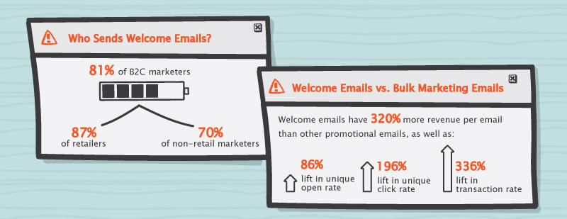
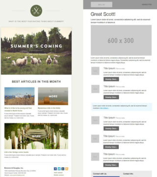
These emails have special characteristics and they aren’t sent in vain as the subscribers are expecting them. As you can see in the image above, which is taken from the infographic “Thank you for subscribing. How to optimize your welcome emails” by EasySMTP, welcome emails:
- Bring in 320% more revenue than any other kind of promotional email.
- They have a transaction rate of over 336%
- Their open rate is 86% higher than other emails.
- The click rate increases by 196%
Data that forces you to give it the correct importance because only then will you achieve welcome emails that increase conversions.
TABLE OF CONTENTS
The welcome email elements that increase conversions
The right welcome email is essential because it is the first impression that a lead will receive once they have become a client. In addition, if it is well worked this email message will also help you to be able to segment the users who receive it.
In fact, welcome emails have two great advantages over other kinds of emails that brands can send to their subscribers:
- On the one hand, it’s the only email that users are expecting because it’s probably the last step in one process and at the same time the beginning of another. The welcome email is the final part of the capture process, which can also include digital ads, landing pages, and registration forms. In addition, this email will usually give the client some information to get them started and help build a relationship with the new brand.
- On the other hand, they contain something that the user wants: either a link to a download, and activation code, confirmation of a purchase, or even something specific like expected delivery times, or the current status of the order.
In the welcome emails that increase conversions you can find 4 kinds of elements:
- The name of who sent the message. Usually your brand.
- The subject of the email.
- The body of the message
- The call to action.
In order to analyse how these welcome emails should be, we are going to break down the elements that are used in 7 particular examples:
1.- SEMRush
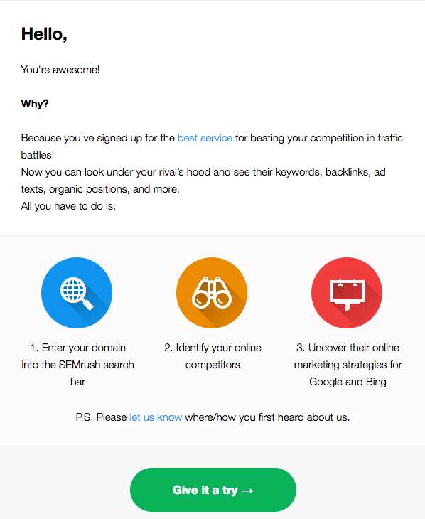
One thing that really stands out in SEMRush welcome emails is that it has a close copy together with a few coloured icons that show the steps the user has to follow in order to take advantage of the purchase. For example, the initial greeting “You’re amazing!” and the friendly way in which they treat you.
In addition, this example includes one of the most common characteristics in welcome emails: Giving trust. To do this, a number of elements are used like social network icons in the header, a list of the most valuable clients, a clear reference to the company’s address, or a prominent and visible link to cancel the subscription.
Another notable function is that they have included a request. “ Let us know how you found us”, which allows them to properly target each user.
2.- Tourism Ireland
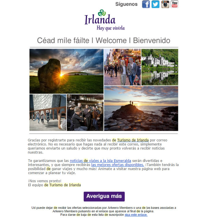
Tourism Ireland starts their welcome email by trying to subscribe you to their latest newsletter. They take advantage of the powerful images and use a highlighted text to greet the user in Gaelic, English and Spanish.
What really stands out though is the call to action. Do you want to know more about Ireland? The highlighted coloured button “ Find out more” is clear enough that the new subscriber will end up clicking on it.
3.- Ello
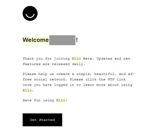
The example of the social network Ello shows that a welcome email doesn’t have to be that far-fetched. A straightforward message containing the logo, a highlighted greeting to the user “ Welcome User”, two brief paragraphs explaining what more has to be done and a clear and straightforward call to action, “ Get started” make up one of the more simpler and attractive welcome emails.
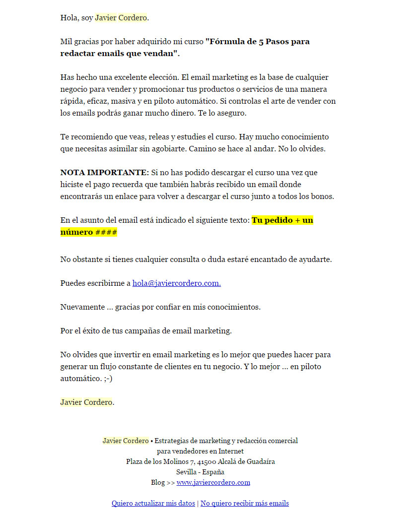
4.- Javier Cordero
In contrast, the welcome email that consultant Javier Cordero sends after signing up to one of his online courses opts to give the customer a detailed explanation of the newly acquired course. Including trouble shooting potential problems such as the inability to download the course.
It also informs the user about the subject of the email where they will receive access to the download: “Your order + #### number”. The consultant’s physical contact details and links to his blog are also included in the footer of the email
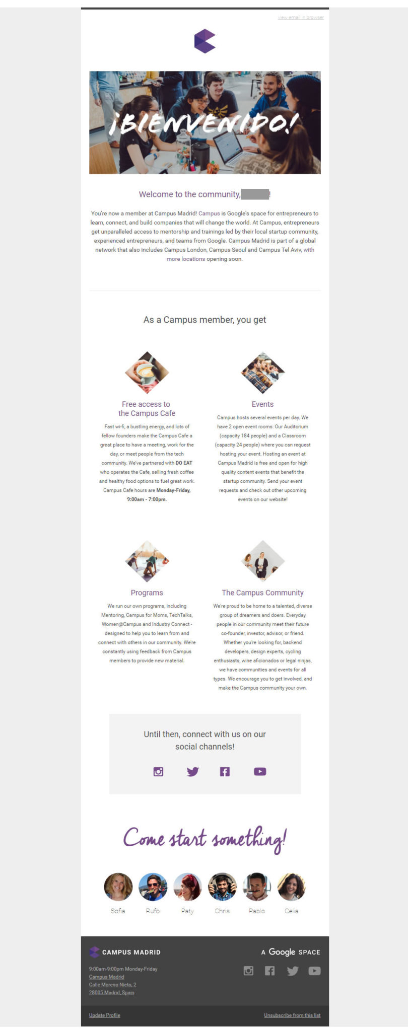
5.- Google Campus Madrid
Google Campus Madrid has put together a manual welcome email that can be broken down into the following structure:
- A header containing the logo and a welcome message together with an illustrative graphic.
- An explanation of what exactly the step you have just taken means.
- An explanation, supported graphically, of what you can do from now on.
- Connection with the different channels in social networks
- Putting you in touch with like-minded users.
- A footer with the postal address, repeating the links to social networks, and the possibility of updating the profile or unsubscribing from the list.
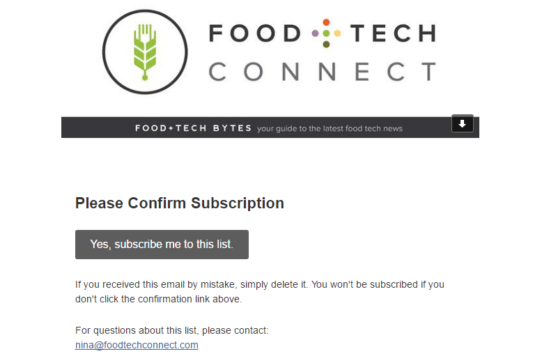
6.- Food Tech Connect
Some of the most common welcome emails are those that request confirmation through a two-step process. The well-known double opt-in shown in Food Tech Connect is a good example of this. They include an identifying header, a call to action with clear text “Yes, subscribe me to the list“, and a link to contact them if you have any questions.
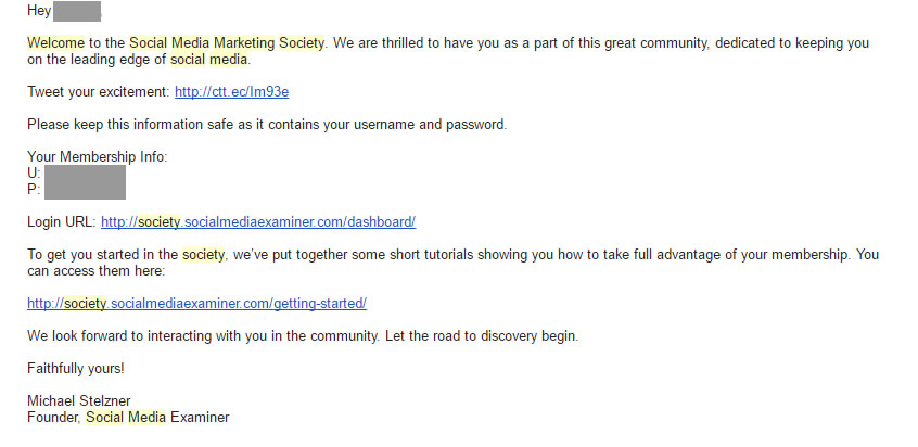
7.- Social Media Society
The last example that we have of a welcome email that increases conversions show that even a message that only contains text can still work. Yes, it’s true that if this message included some form of design in it, it would probably be easier to read. However, this option makes sure that everyone reads the message, regardless of the device used.
However, this message is an example of good practices by including:
- A welcome thank you.
- A request to share on Twitter
- Basic information and how to access it in the future.
- What to do next: read the tutorials that you can find in the link provided.
- Identifying who sent the message
10 things to watch out for in welcome emails
To sum up, as we have seen in these examples, in order to create welcome emails that increase conversions it is important take into account the following 10 factors:
- Don’t keep the subscribers waiting. Ideally, these types of emails are automated so that once a user has filled in a form, the welcome email should be launched. The longer it takes for the email to arrive the less likely it is to be opened. After pressing the call to action the subscriber is waiting for you message, make sure that they get it as soon as possible.
- Let the user know who has sent the message. Remember: the users are waiting for the email to arrive so make the identification process simple. Put a name that can easily be recognised by the user so that there isn’t any confusion about who is sending it.
- It helps for the design to be responsive. More and more people are reading their emails on mobile devices so don’t make the mistake of not creating welcome emails that can be read on both mobiles and tablets. It’s a serious error that users find unforgivable, even more so if it’s a message that they either want or need to receive and read.
- Personalize. To do this you will need to obtain some type of personal information from the form.
- Inform the recipient of the kind of message they will receive. It is essential that they know what email they are waiting for. Let them know from the beginning, in the subject line of the email for example.
- Thank them for the action that they have just done. It is the most important (thing) in these kinds of messages. Don’t forget that the user has put their trust in you so show them your appreciation in a clear and evident way.
- Add access to your different channels on social networks. It’s a way of finding you on the channels that they decide to use.
- Tells us what steps need to be taken next. The welcome emails are not just the end of a process; they are the first step in an on going relationship where the user is now the client. Give them clear instructions on what they have to do and also what they will get out of it.
- Request more information to segment your users. The welcome email is ideal for asking users to give you more information. To do this, bring value to them so that they will provide you with essential data to properly segment your database.
- Incite action with an attractive CTA. It encourages subscribers to carry on performing actions. Do you want to be followed on social networks? or fill out a survey? Do you prefer to point them in the direction where they can find offers? All of this must be clearly evident in the call to action that you are offering.
Finally, you wont achieve good welcome emails that increase conversions without using a professional email marketing platform. Only then will you have the necessary tools to automate the process and measure your results in real time. Sign up to MDirector for a trial of the best email marketing software on the market for building welcome emails that increase real conversions.
