MDirector takes a leap and renews its brand image
os 28 de April de 2021
o 28/04/2021
MDirector has taken an extraordinary leap forward…Do you want to see it?
At MDirector we have long contemplated taking the necessary leap that allows us to adapt to the current times and offer our clients an improved product managed by a team of outstanding professionals.
Today is the day:
We are proud to introduce the new MDirector brand image!
ÍNDICE DE CONTEÚDOS
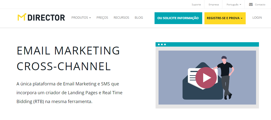
New logo
We have revised the logo with new corporate colors. Yellow symbolizes joy, optimism, and good ideas and petrol blue brings a sense of seriousness and strength. All these concepts are aligned with MDirector’s philosophy.
Given the new reorganization of the group, it was necessary to give MDirector an identity of its own, one in which the differential services that the company offers can be recognized. In this way, the letter M, which will function as an isotype, has the shape of an envelope, establishing a direct identification with email and communication.
Web renewed
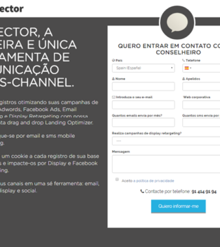
This same essence has inspired the redesign of our website, whose new look and feel claims the ease of use and simplicity that have always been the hallmark of MDirector. Combining illustrations and images results in a cleaner, more direct and fresh composition.
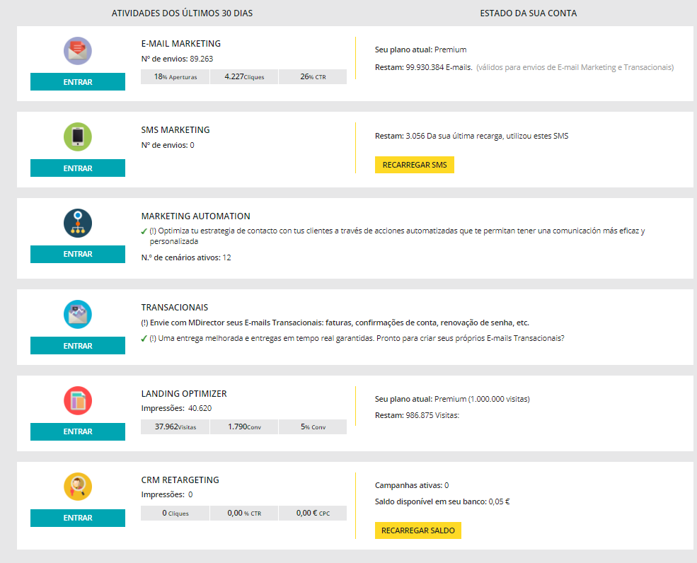
More visual platform
The evolution that MDirector has undergone in recent years deserve a makeover of its platform to keep up with competitors. The new look and feel of the interface is simple and versatile. With the same user friendliness as always!
All new clients that create their account in MDirector will be able to enjoy the new design and its possibilities. Existing customers will be migrated gradually.
And you? Do you want to experience the new MDirector? Take the leap!
